How to Preview Documents with the Hover Panel
About the Hover Panel Component
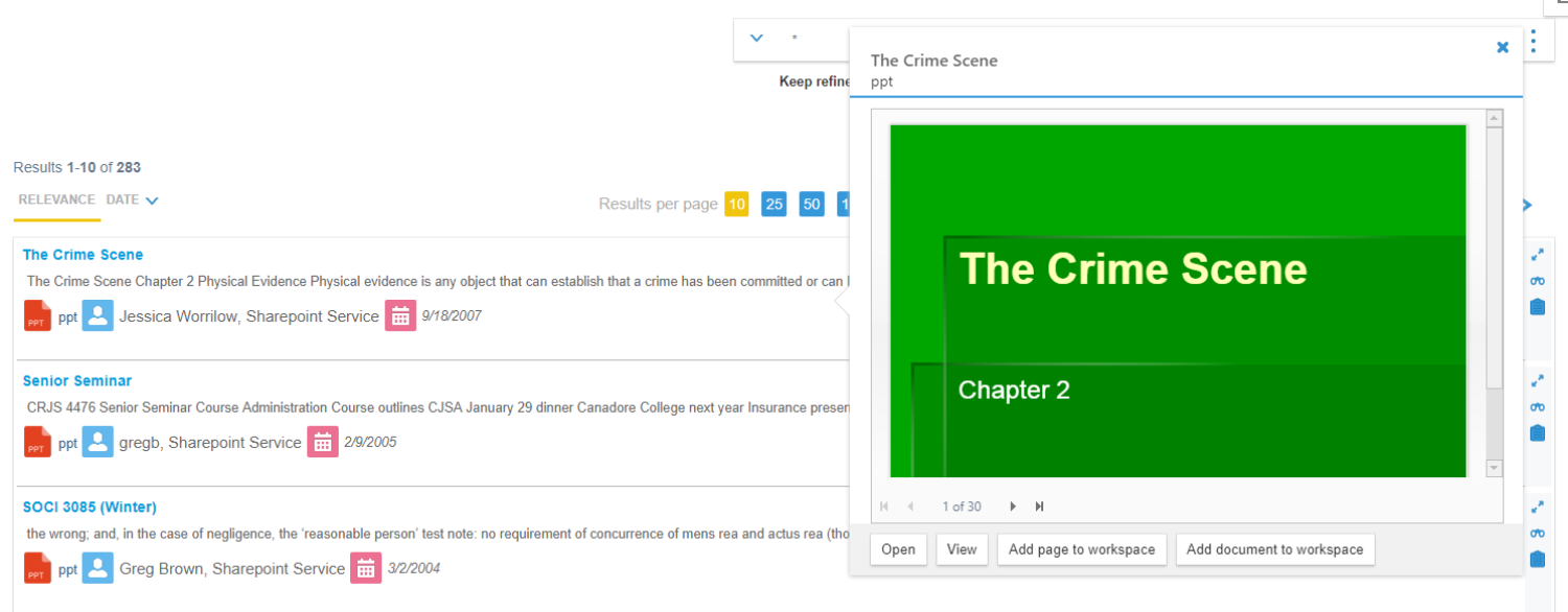
The Hover Panel component lets users quickly view a document preview when they hover through their SmartHub query results.
If Smart Previews is installed, the document preview is shown in the panel.
Otherwise, the panel displays the document metadata.
Example of a Document Preview

Example of a Document Preview with Smart Previews

How to Configure Your Hover Panel
- To configure the Hover Panel feature, copy some or all of the feature's configuration settings into your page’s custom settings file and modify them as you see fit.
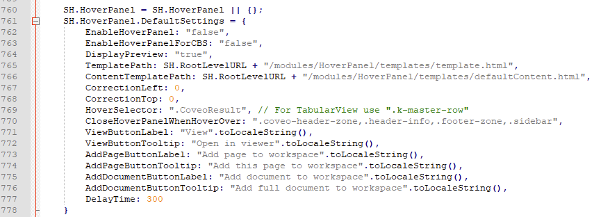
- Hover Panel settings from the file DefaultModuleSettings.js are shown in the screenshot below.
- The settings for Hover Panel can be found in the the section
SH.AdvancedSearch.DefaultSettings(around line 761) in the file DefaultModuleSettings.js, located in the directory <SmartHub_root>\modules\SmartHubResourceLoader\DefaultModuleSettings.js. - Section
SH.HoverPanel.DefaultSettings(around line 761) in the file DefaultModuleSettings.js is shown below. - Modify the settings as described below.

- The file DefaultModuleSettings.js must not be modified because it is overwritten at upgrade time.
- All files within the directory <SmartHub_root>\CustomerCustomization are overwritten at upgrade time. Copy the directory and rename it before using its files in a production environment.
All the changes to Hover Panel settings should be done via the custom settings file created for the page (such as ResultsCopyCustomSettings.js).
For more information, see How to Customize Your SmartHub User Interface.
Example: Hover Panel in Existing Page - Results.html
To modify your Hover Panel, open the DefaultModuleSettings.js settings file (shown above), and do the following:
- Copy some or all of the Hover Panel code from the settings file, around line 761.
- Paste the code into your custom settings file (such as "ResultsCopyCustomSettings.js") in the appropriate section.
Note!! If you migrated custom settings files from a prior version of SmartHub, you must add the HoverPanel settings code in the appropriate section of your custom settings file. See the following screenshot.
- Modify the code as you see fit.
- Refer to the settings parameters below.
Settings Example
SH.HoverPanel.CustomSettings = {
    EnableHoverPanel: "true"};

SH.HoverPanel.PathsToExclude =[];
Settings Parameters
| Setting Name | Default Value | Description |
|---|---|---|
| EnableHoverPanel | "false" |
true - Hover Panel is enabled false - Hover Panel is disabled |
| EnableHoverPanelForCBS | "false" |
true - Hover Panel for Content By Search components is enabled false - Hover Panel for Content By Search components is disabled |
| DisplayPreview | "true" |
true - if available, preview is displayed false - document metadata will always be displayed, even when preview exists |
| TemplatePath | "/modules/HoverPanel/templates/template.html" | Hover Panel template path. You can customize the template and provide the path to the custom template here |
| ContentTemplatePath | "/modules/HoverPanel/templates/defaultContent.html" | Content template path for document metadata. Customize this if you want to show different metadata in the panel |
| CorrectionLeft | 0 | Number of pixels used to shift the hover panel to the left. This can be a negative value |
| CorrectionTop | 0 |
Number of pixels used to shift the hover panel to the top. This can be a negative value |
| HoverSelector | ".CoveoResult" | Hover panel will be displayed when you hover over elements with this selector. For TabularView use ".k-master-row". |
| CloseHoverPanelWhenHoverOver | ".coveo-header-zone,.header-info,.footer-zone,.sidebar" | A list of class selectors that when hovering over the elements with one of the specified class, the hover panel will automatically close |
| ViewButtonLabel | "View" | The label of the "View" button |
| ViewButtonTooltip | "Open in viewer" | The tooltip of the "View" button. Provides details about the performed action when clicking the button |
| AddPageButtonLabel | "Add page to workspace" | The label of the "Add page to workspace" button |
| AddPageButtonTooltip | "Add this page to workspace" | The tooltip of the "Add page to workspace" button. Provides details about the performed action when clicking the button |
| AddDocumentButtonLabel | "Add document to workspace" | The label of the "Add document to workspace" button |
| AddDocumentButtonTooltip | "Add full document to workspace" | The tooltip of the "Add document to workspace" button. Provides details about the performed action when clicking the button |
| DelayTime | 300 | Number of milliseconds that you have to hover over an item in order for hover panel to be displayed. |
How to Show Different Metadata in Your Hover Panel
The default template can be found in the directory \modules\HoverPanel\templates\defaultContent.html.
- In order to customize the metadata shown, create a new HTML file in your customizations folder, and copy the content of defaultContent.html in it.
-
Modify the new template adding the following snippet for every metadata property that you want to show:
Copy<div class="hp-content-property">
<div class="hp-content-subtitle">
Custom metadata title
</div>
<div class="hp-content-property-value">
<%= resultItem.CustomMetadata %>
</div>
</div>Example of Custom Template
Copy<div id="<%= 'hp-metadata-container_' + elementId %>">
<div class="hp-content-property">
<div class="hp-content-subtitle">
Contributors include
</div>
<div class="hp-content-property-value">
<%= resultItem.DisplayAuthor %>
</div>
</div>
<div class="hp-content-property">
<div class="hp-content-subtitle">
Last modified
</div>
<div class="hp-content-property-value">
<%= new Date(resultItem.LastModifiedTime).toLocaleDateString() %>
</div>
</div>
<div class="hp-content-property">
    <div class="hp-content-subtitle">
        Custom metadata title
    </div>
    <div class="hp-content-property-value">
        <%= resultItem.CustomMetadata %>
    </div>
</div>
</div> -
Lastly, change the ContentTemplatePath setting to the path of the new custom template:
CopySH.HoverPanel.CustomSettings = {
EnableHoverPanel: "true",
ContentTemplatePath: "/modules/customizations/HoverPanel/templates/customContent.html"};
SH.HoverPanel.PathsToExclude =[];
How to Disable the Hover Panel Component
To disable your Hover Panel, use the following instructions:
- Open the custom settings file (such as "CustomResultsSettings.js") for the page you want to modify.
- For example the SmartHub Index and Results pages have the corresponding setting files IndexSettings.js and ResultsSettings.js.
- For example the SmartHub Index and Results pages have the corresponding setting files IndexSettings.js and ResultsSettings.js.
-
Change the parameter EnableHoverPanel to "false".
CopySH.HoverPanel.CustomSettings = {
EnableHoverPanel: "false"};
SH.HoverPanel.PathsToExclude =[]; - Save your custom setting file.